Dashboard redesign and design system for building interactive replays
Reprise is an enterprise product not only for building replays but also for marketing those replays to boost sales. It has done a great job focusing on the builder's needs, but marketers have expressed frustration on the overall usability of the dashboard.
• Build a friendlier interface that instills confidence
• Increase traffic on the overall Reprise product
Product Designer, SaaS Web Design, User Research, User Testing
Sarah Idriss, Jasmine Mann (product managers)
Simone Liu (lead developer)
Jan 2022 - Aug 2022
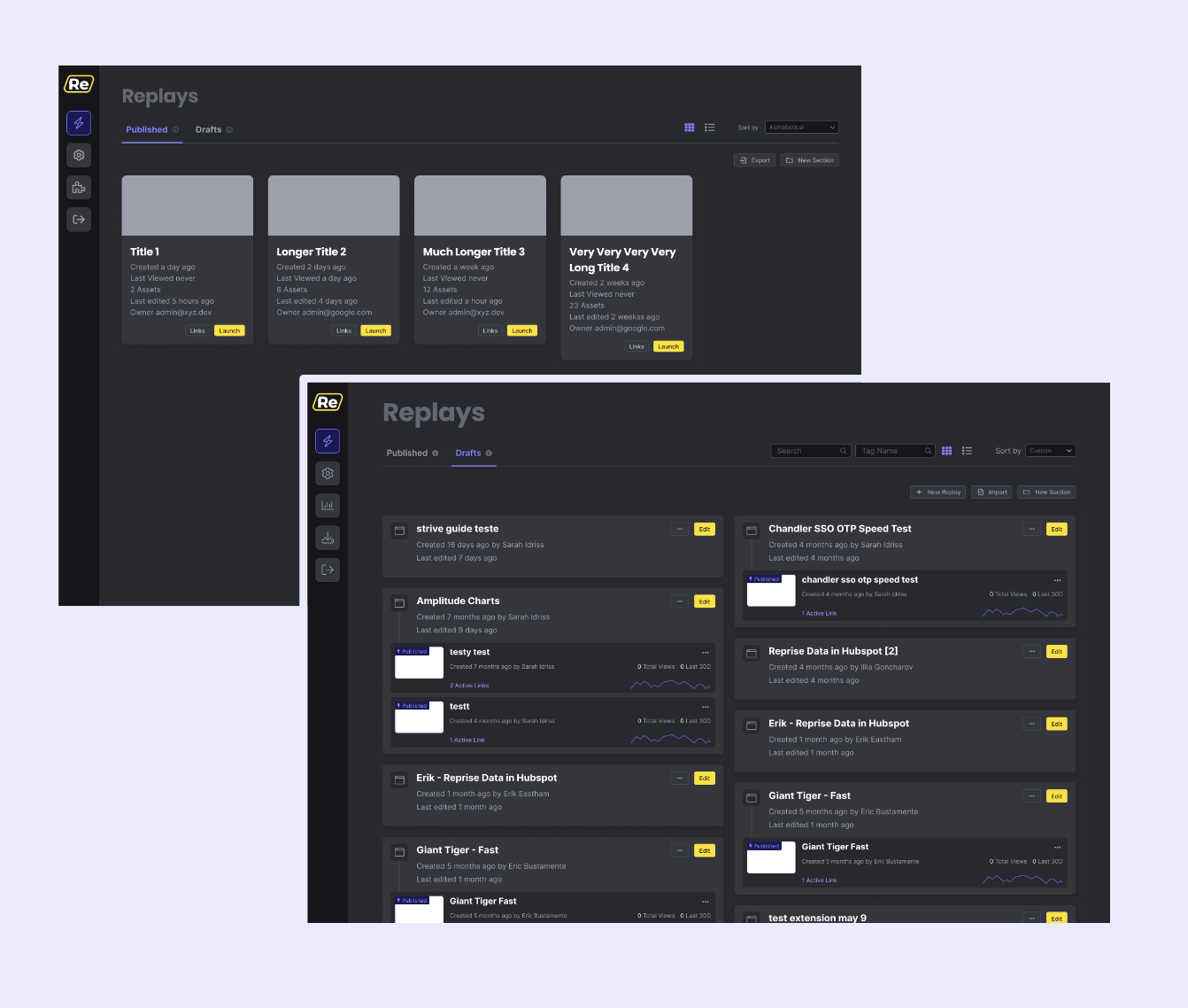
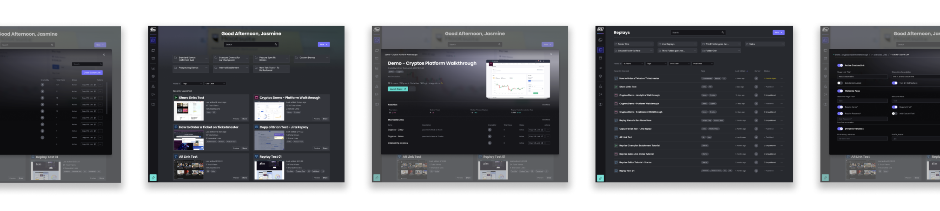
Marketers are typically not involved in the building of the replay. Therefore, the current dashboard being organized as 'Draft' replays and 'Published' replays is ambiguous and intimidating to them.
How might we design an effortless experience for both our replay builders and our marketers?
A rebranded designated home for builders and marketers, respectfully, would give confidence in completing their definitive tasks and roles in the powerful Reprise app.
Our clients took a usability test to complete actions in the dashboard, and there were many pauses of confusion. We concluded the interactions to get to our prized features were too complex, disorganized, and unfamiliar.
How might we provide thoughtless navigation in order for marketers to get the job done?
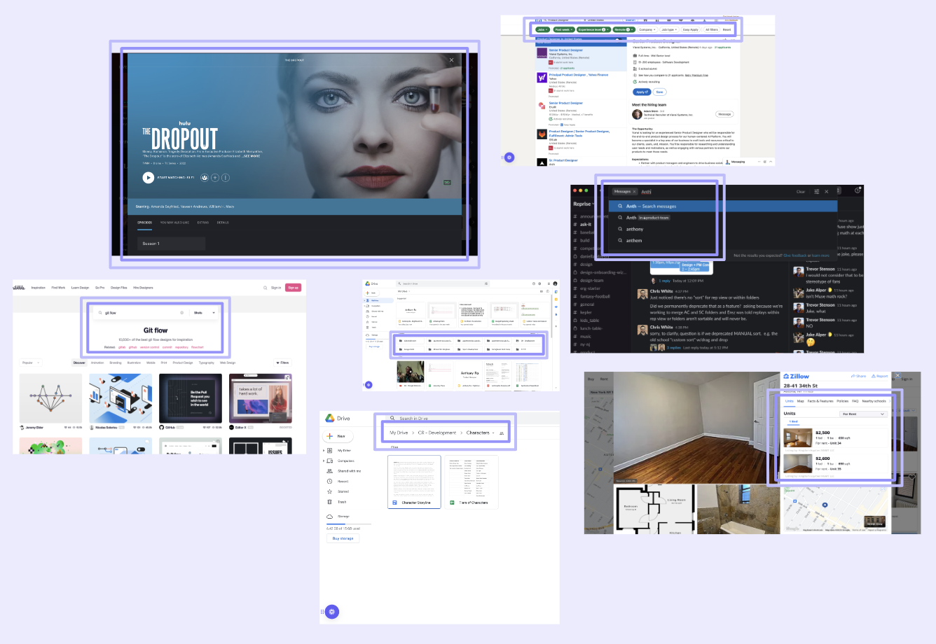
I went on a witch hunt through countless products in all industries with the question in mind.what makes these products intuitive?
• what makes these products intuitive?
• can these interactions be appropriately
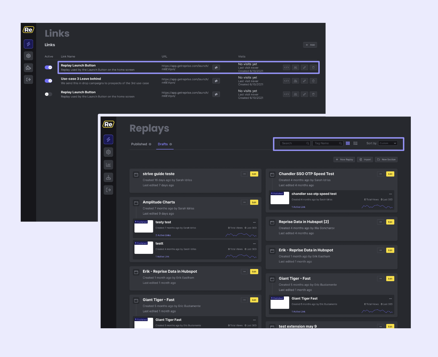
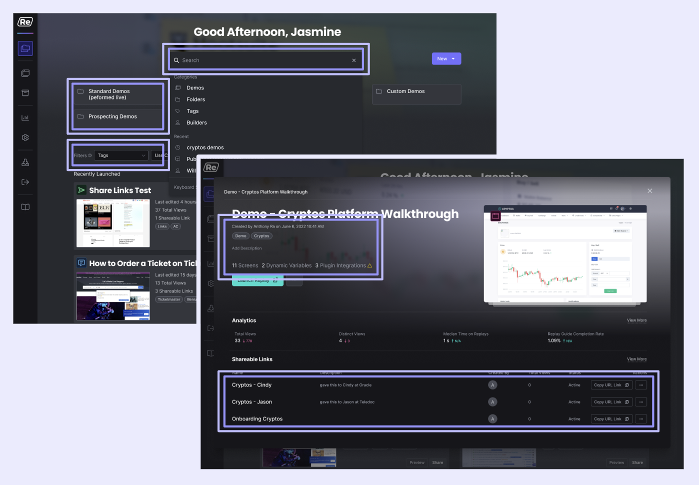
The share custom link feature allows marketers to make countless different iterations of a single published replay by adding properties (changing names, dates, images, etc.) for each target client.
However, our most valuable feature falls short in making clear these opportunities to our clients.
How might we showcase the business side of Reprise's custom share link feature?
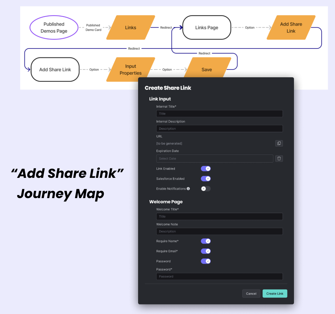
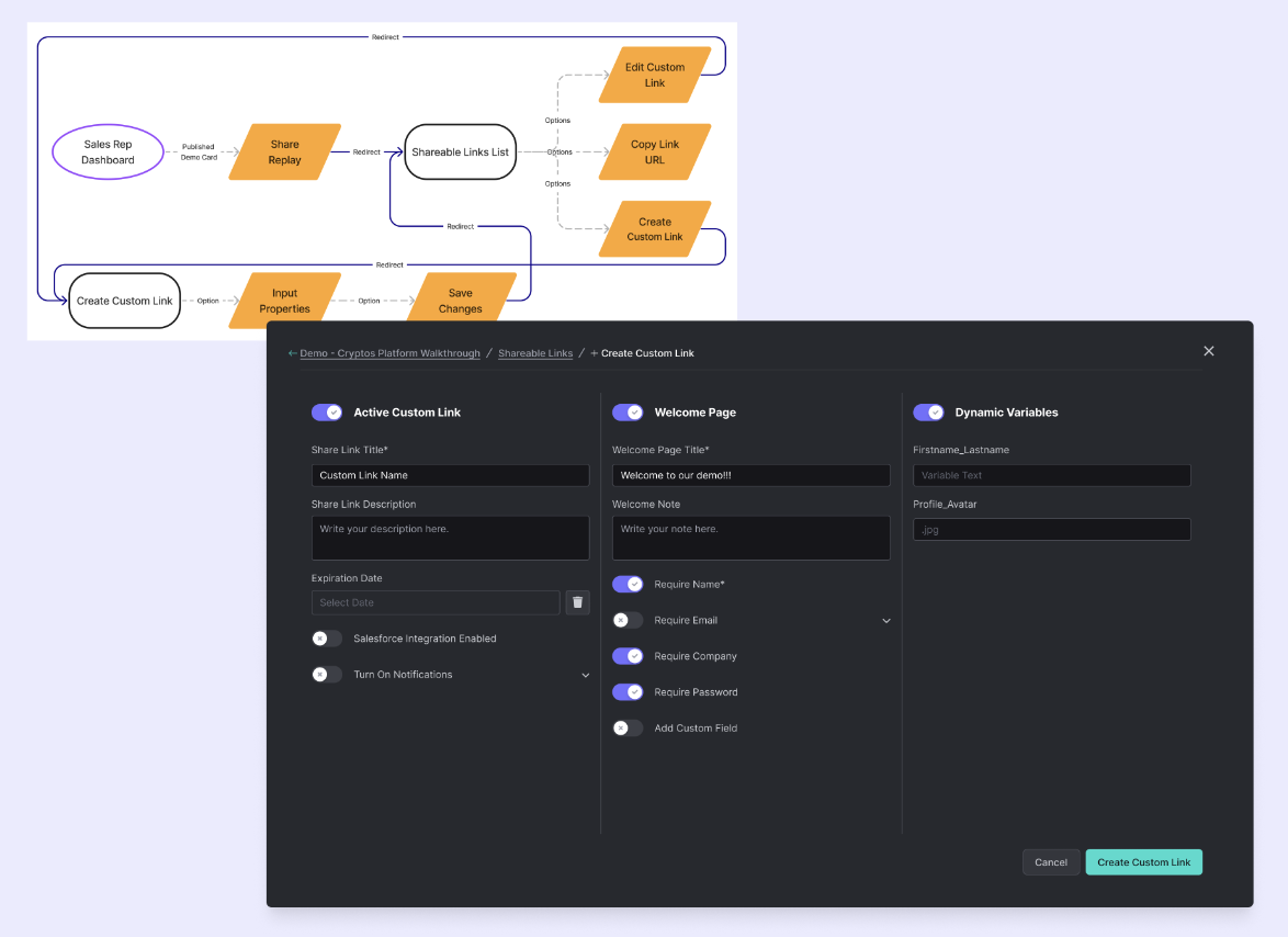
My goal was not only to help marketers get to the share custom link feature with ease but also provide easy-to-understand properties and user flexibility, so they better understand how this feature benefits their business.
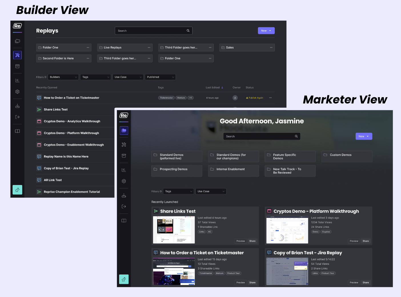
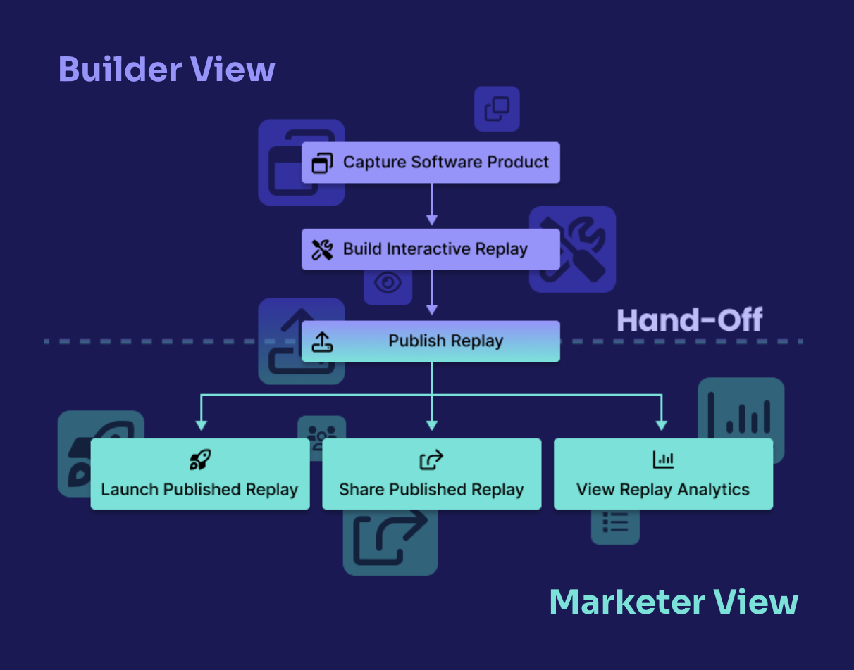
Define their roles
• Builder view focuses on product capture and replay creation.
• With proper hand-off, marketer view hones in on its replay launch, share, and analytic experience.
'Don't make me think...'
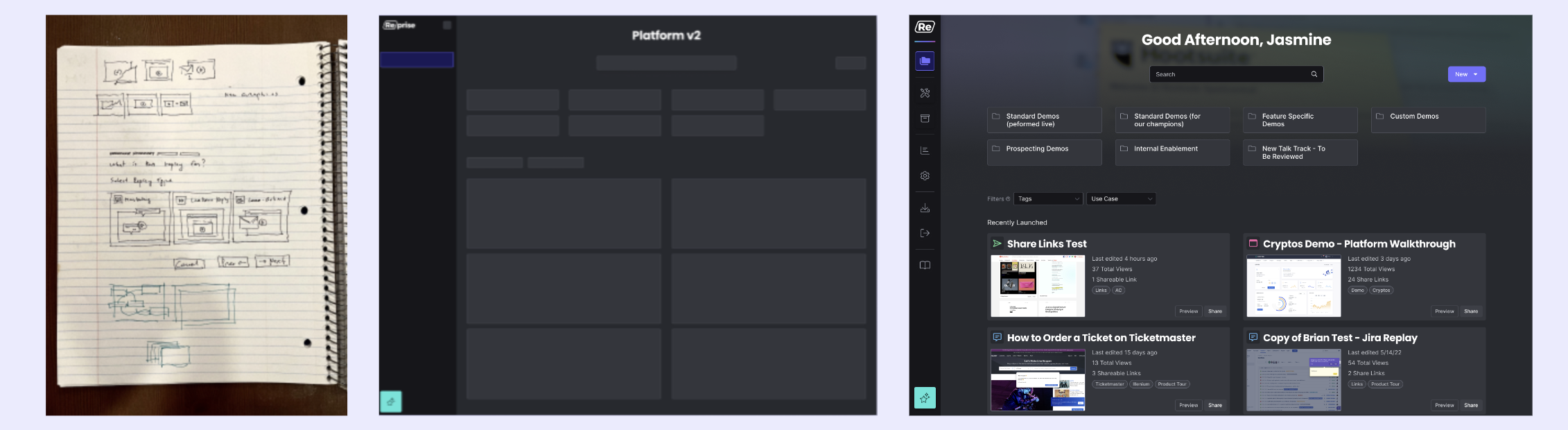
Finding your replay contents should be a thoughtless task, right? Here are some ways our platform has improved.
• Mega-search - get to your destination quicker
• Folders - group your set of replays
• Shareable links - surface customized replay links
• Aggregate filters - sort functionalities under a single navigation
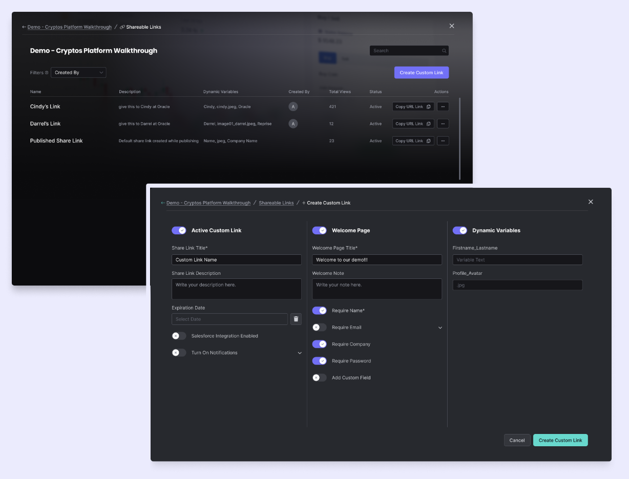
Create your custom share link
Make it easier to personalize an interactive replay for their target clients.
• Seamless creation experience backed by our ideation and journey mapping
• Improved feature hierarchy for a thoughtless link creation process
From listening to our clients to enhanced implementation, we have seen a welcoming increase in dashboard traffic.
18%
37%
Light display mode
Provide more flexible display modes for marketers
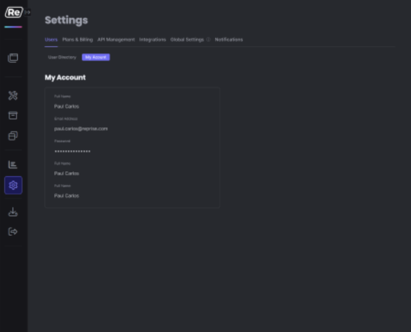
Account-level settings
A central hub for dashboard and user settings
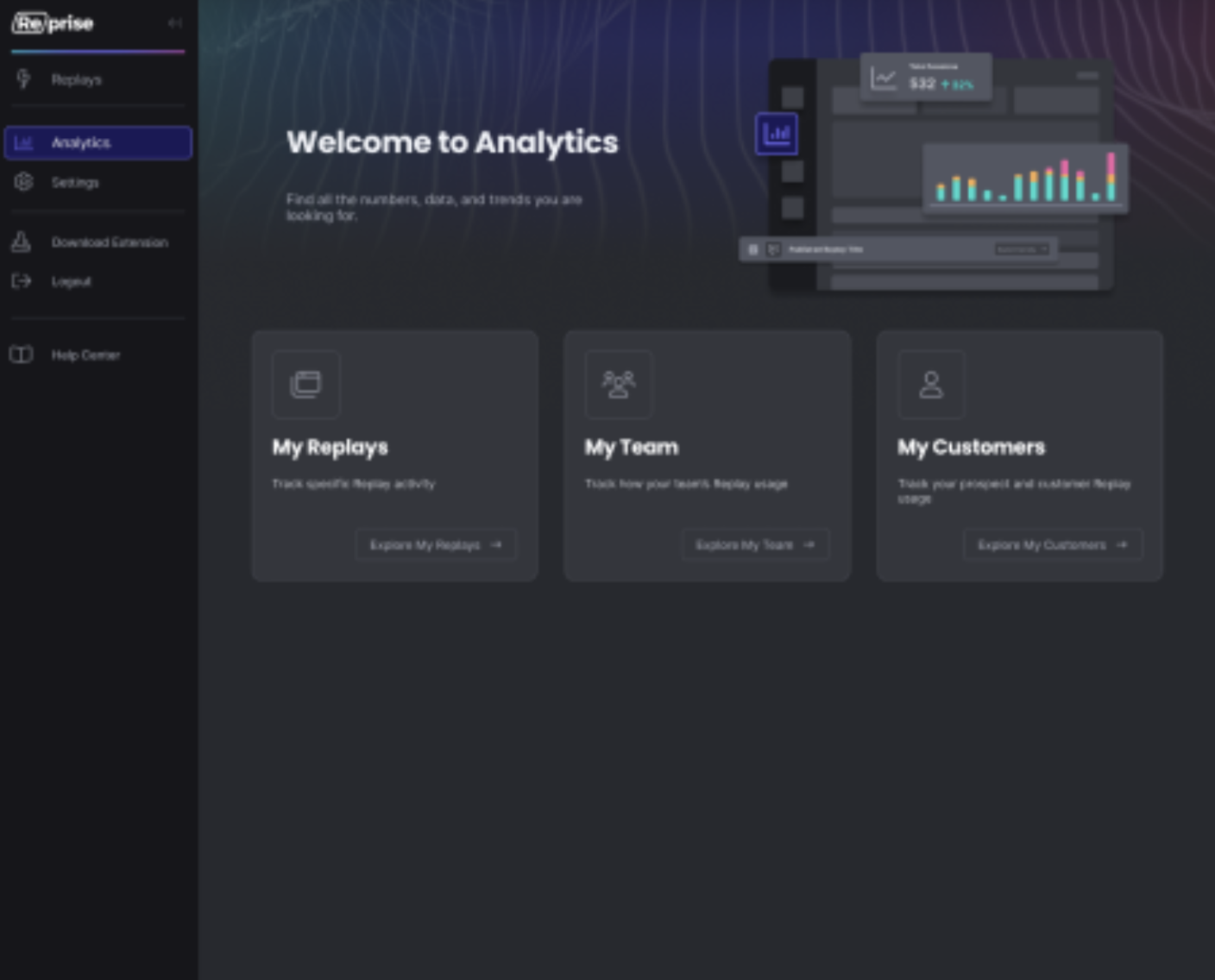
Analytics redesign
Persona-specific navigation with more in-depth data
Where do I find anything?
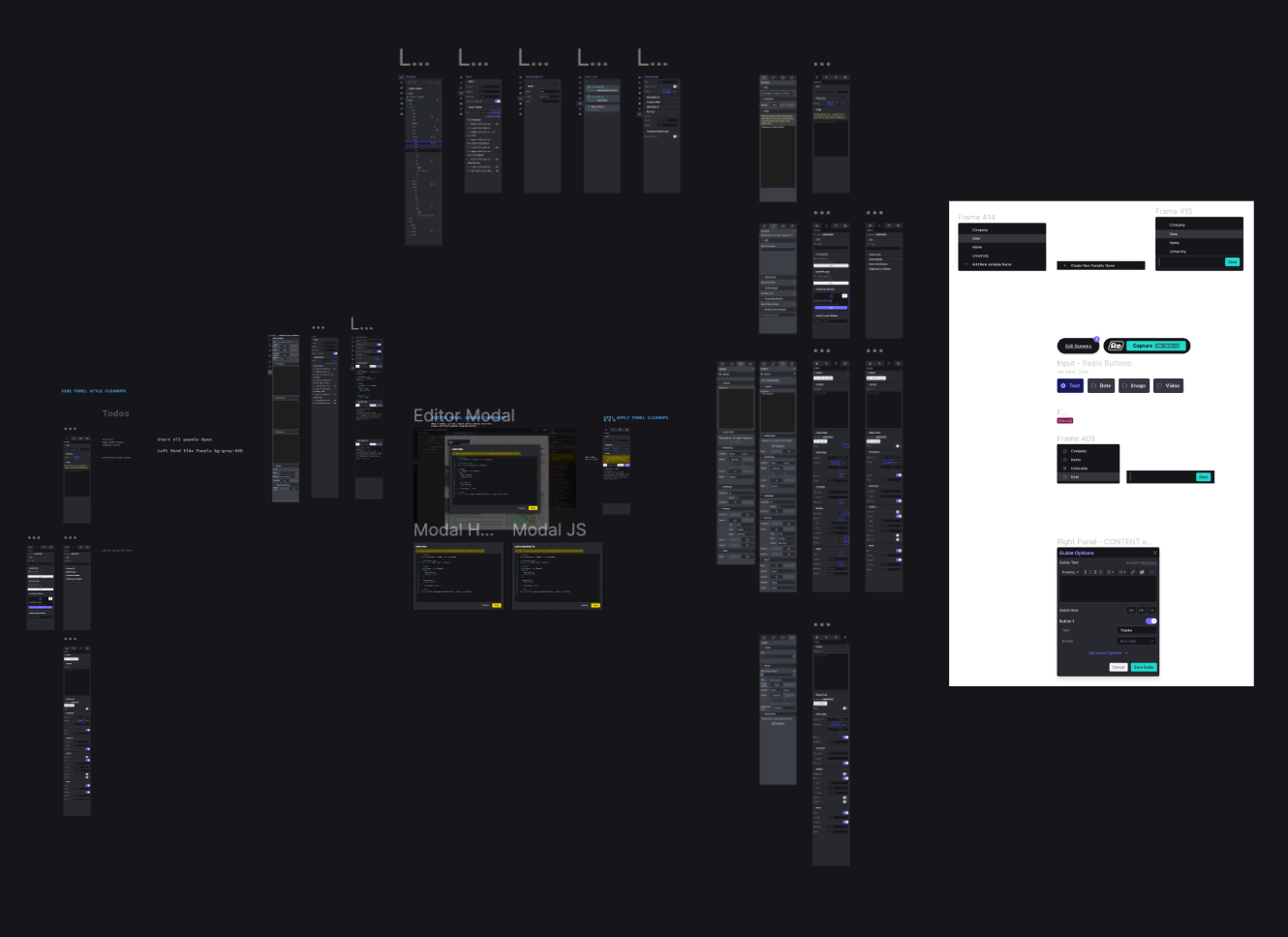
Our current design system had become a complete mess. It has led to a scavenger hunt of design components and multiple designs of the same feature without anyone's knowledge.
Let's clean it up
I devoted my time to clear organization of our design tokens and all its groupings. I wanted to make it so easy, a marketer can go in and find exactly what they need.
Champion for universal design
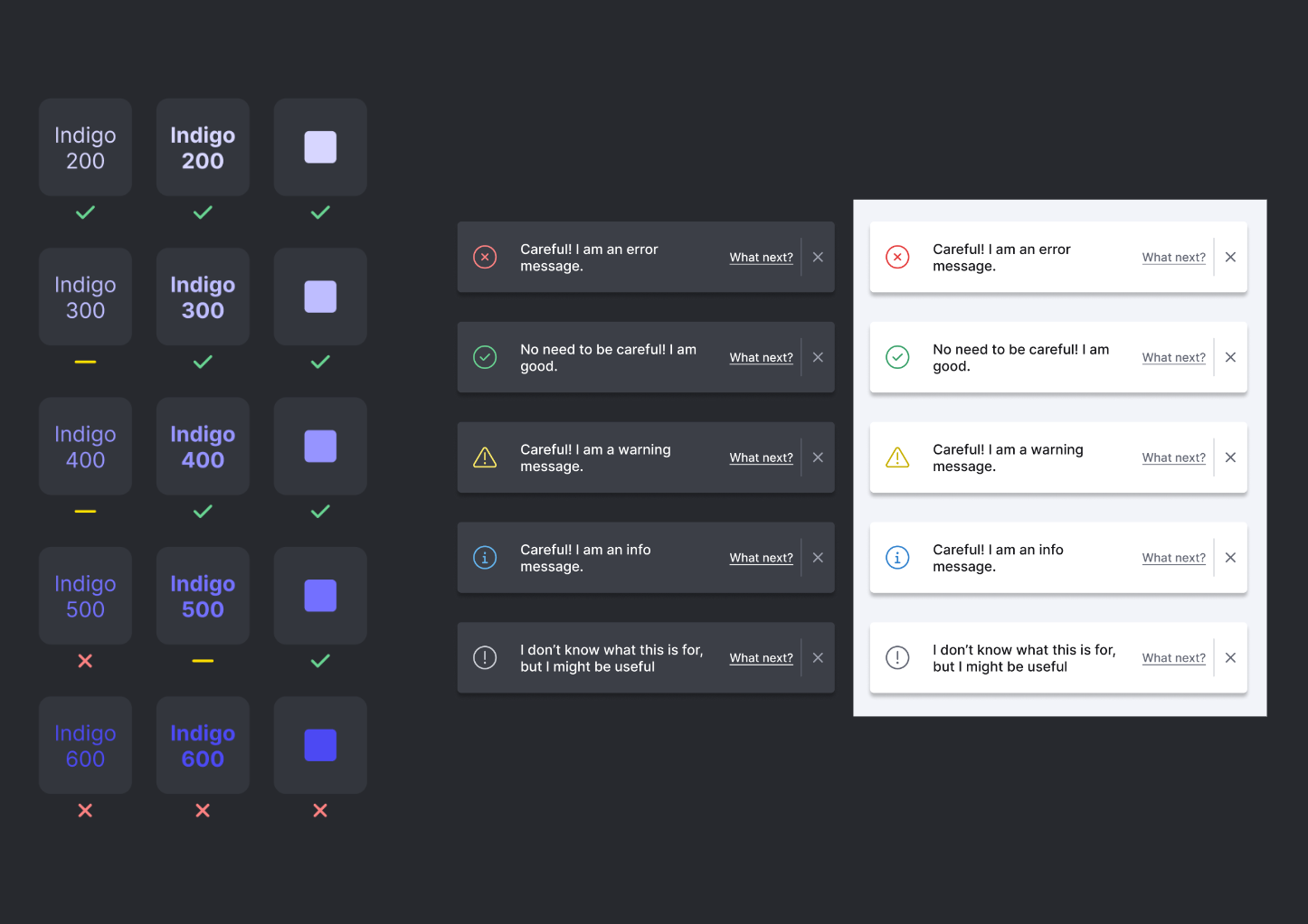
As Reprise becomes an integral part of enterprises companies, I also prioritized accessible design practices.
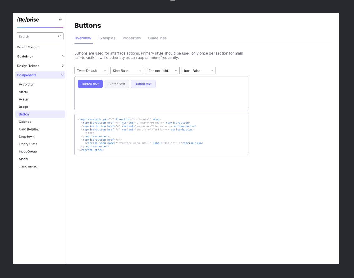
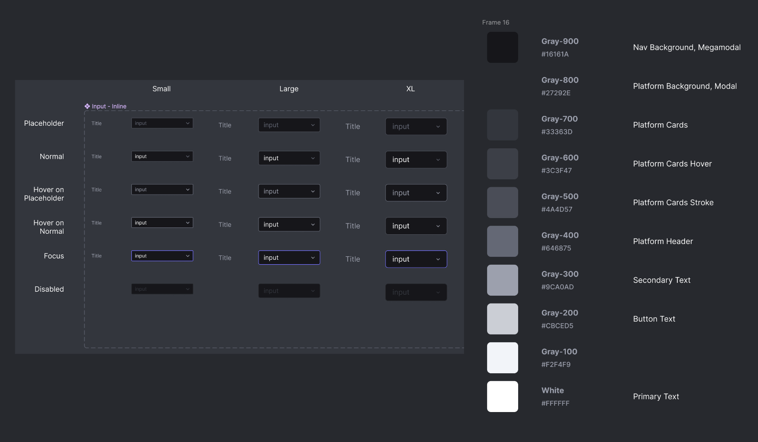
Web application design system
My next steps were to expand the design system for wider product team accessibility - developers, product managers, and other designers.