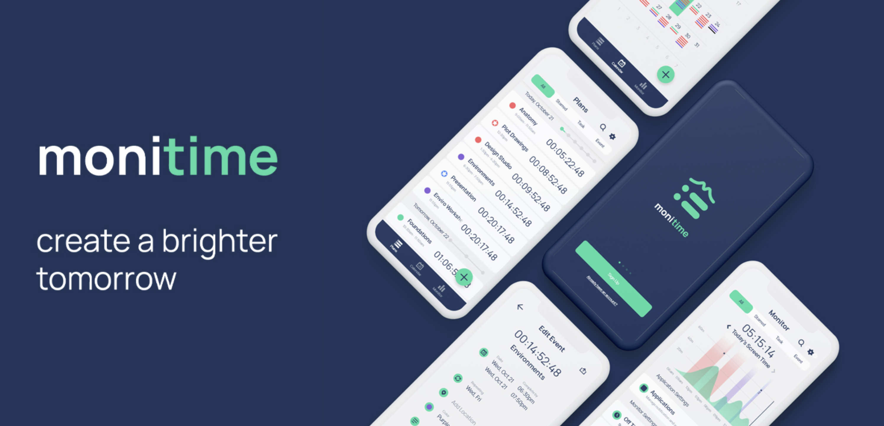
Monitime
User experience design case study for Springboard
User experience design case study for Springboard
Synopsis
• Often leaving work to the last minute?
• Always on social media when you shouldn't?
• Staring at your screen for most of each day?
Monitime is a productivity application focused on those who aspire to be more conscious and healthy in their daily schedule.
Individual UI/UX Designer, Branding, Mobile App Design, User Research, User Testing
CB Hicks (Mentor)
Aug 2020 - Nov 2020
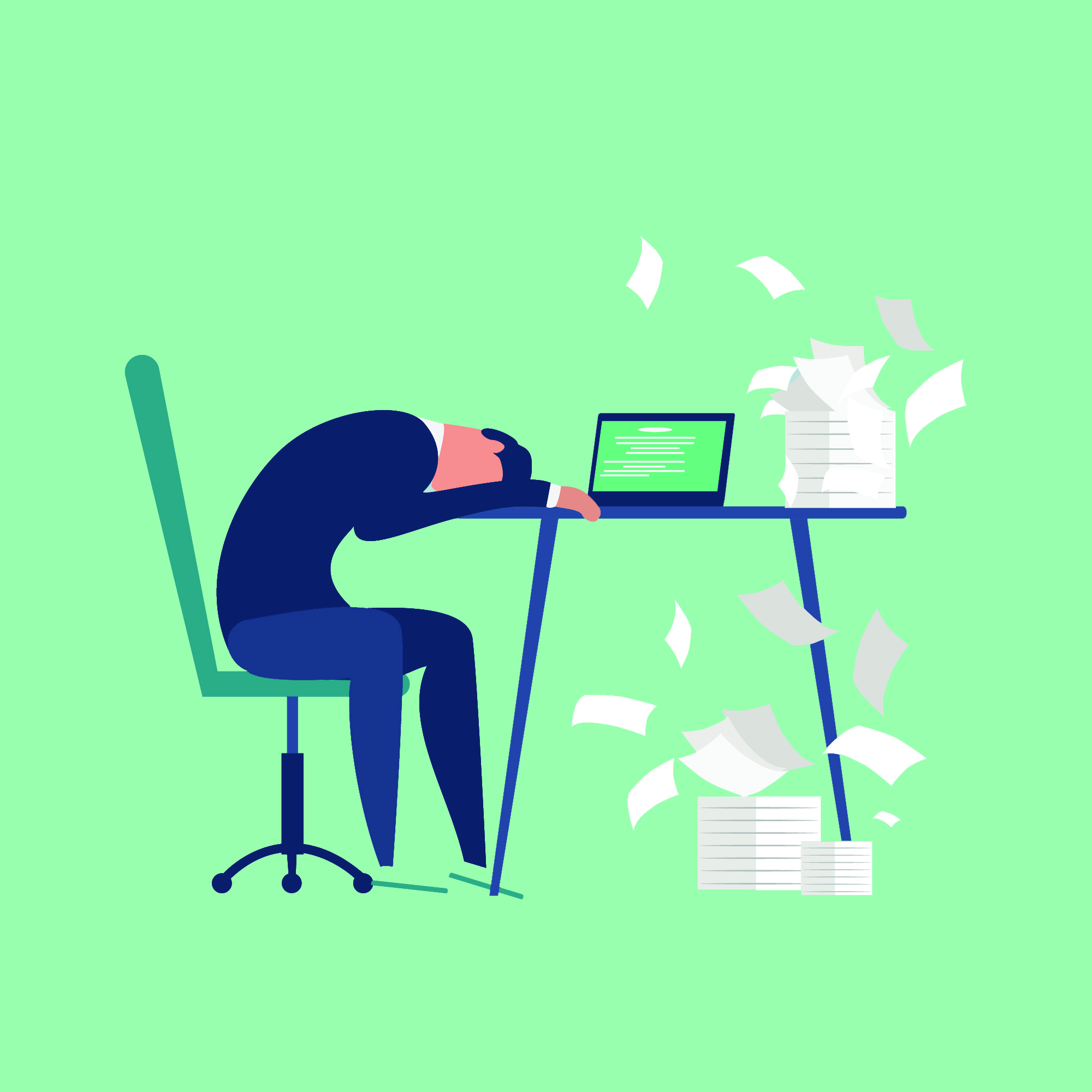
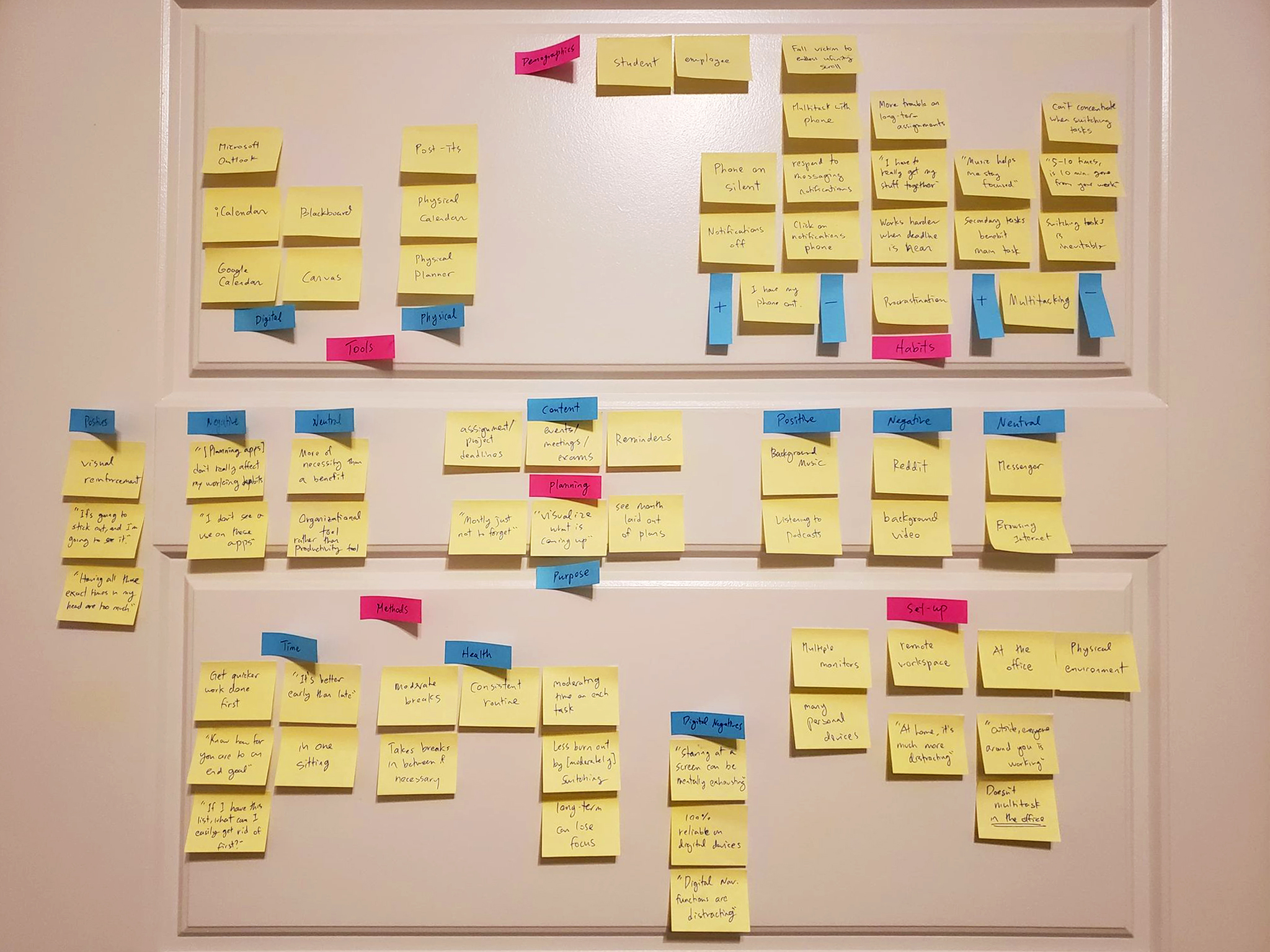
Remote work/school during the height of the coronavirus increased our reliance on our digital tools to succeed. So naturally, I have been curious of the effects technology has on our work...
• What are common trends in the way users work?
• What do these apps actually achieve?
• Can an app really enhance productive habits?
Many of the respondents have used at least one productivity app; however, those same respondents still believe their work habits have much to be desired.
24
88%
75%
63%
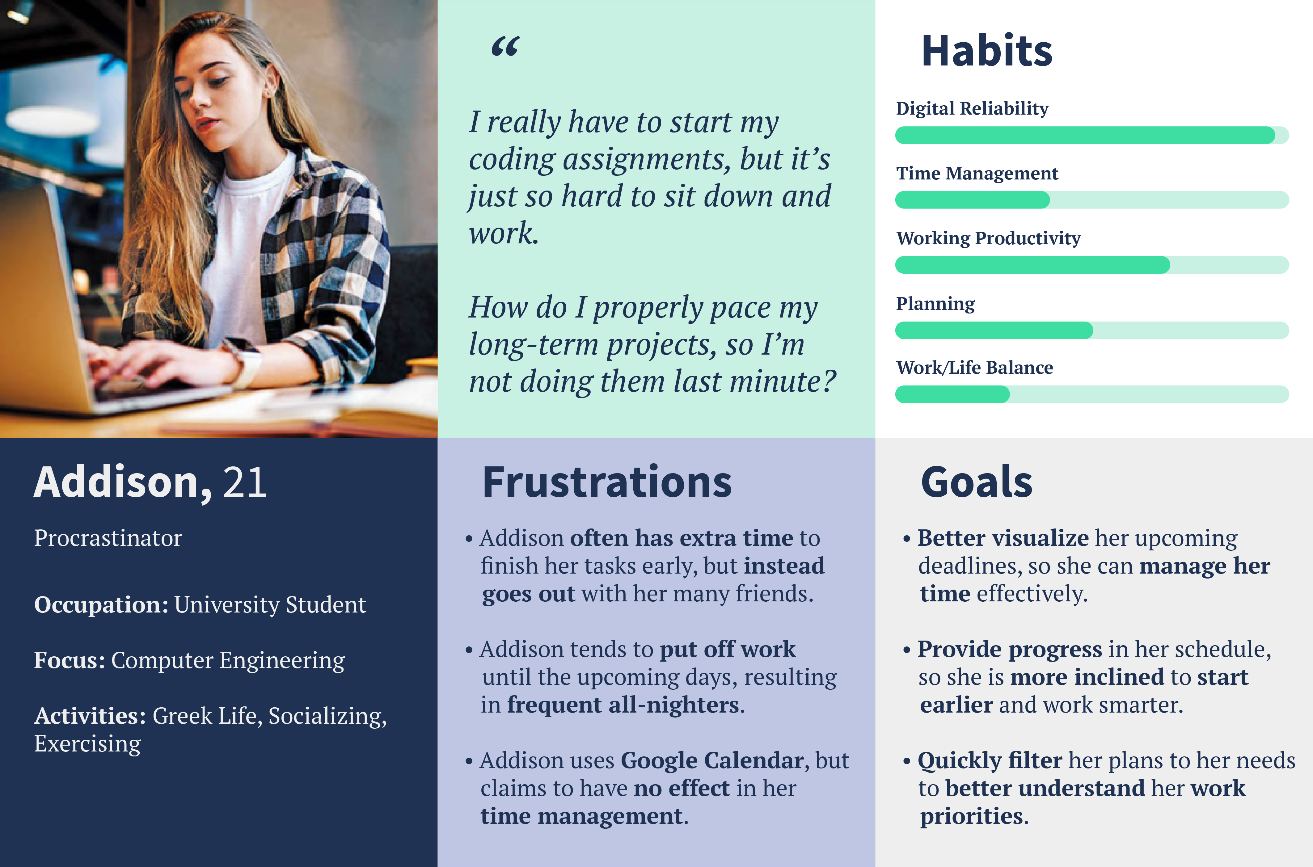
A college student who often procrastinates.
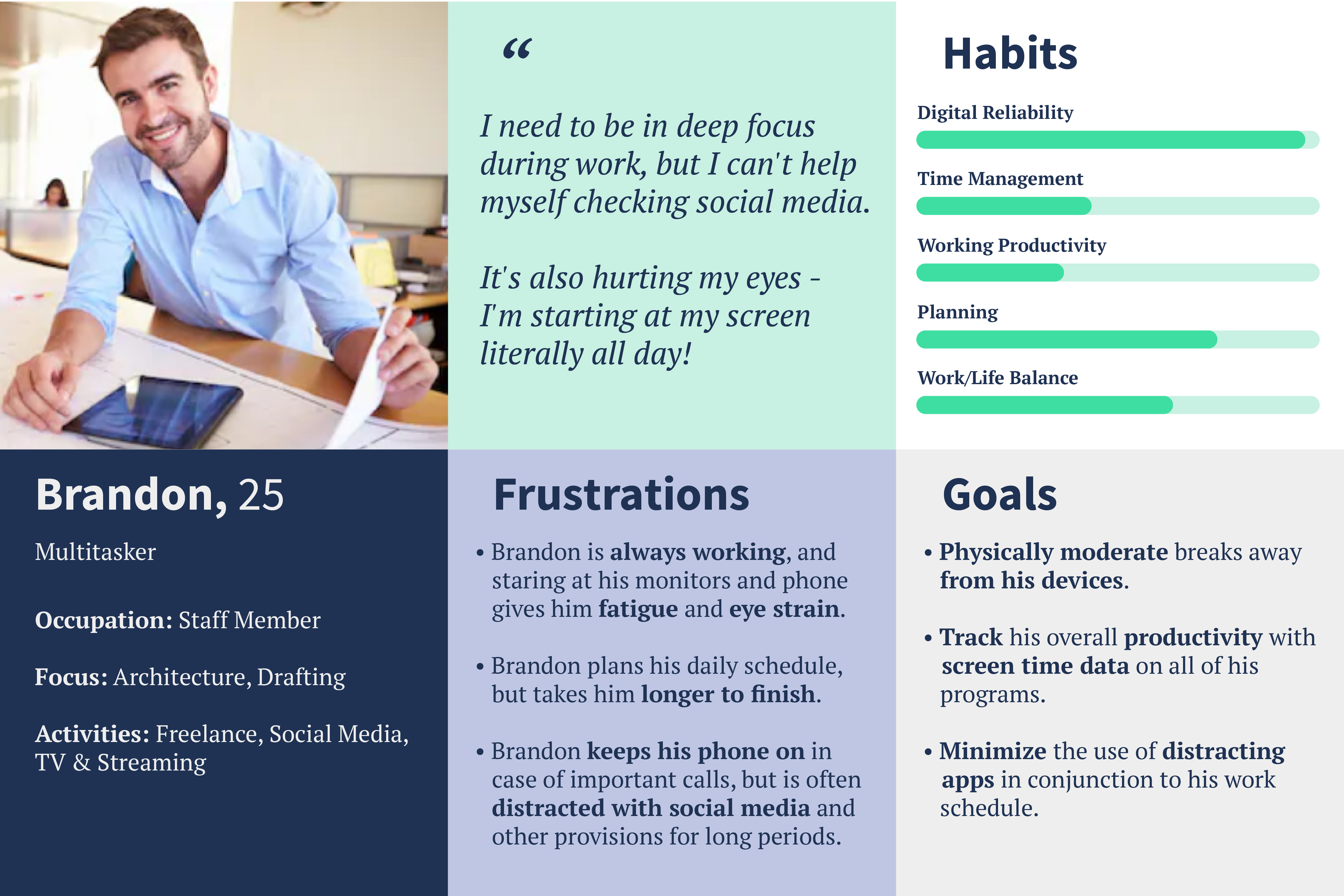
An office employee who often multitasks.
How might we help users to be more inclined to work smarter?
How might we help minimize their use of "distracting" apps while working?
How might we visualize the effects of their now-increased screen/work time?
How might we solve these problems in one consistent interface?
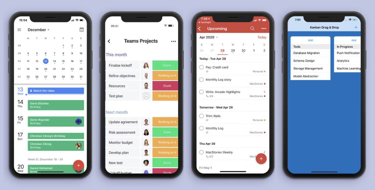
I perused through competing apps of Google, Monday, Todoist, and Trello. These were the over-arching principles in designing a successful product.
Aesthetic & Minimalist Design
The last thing users want is an app that adds to the stress.
Recognition of Routes
If users have to learn it, they are not going to use it.
Consistency & Standards
The app features can't all look different. Consistency is key.
Flexibility & Efficiency of Use
Provide individuality, diversity, and variability.
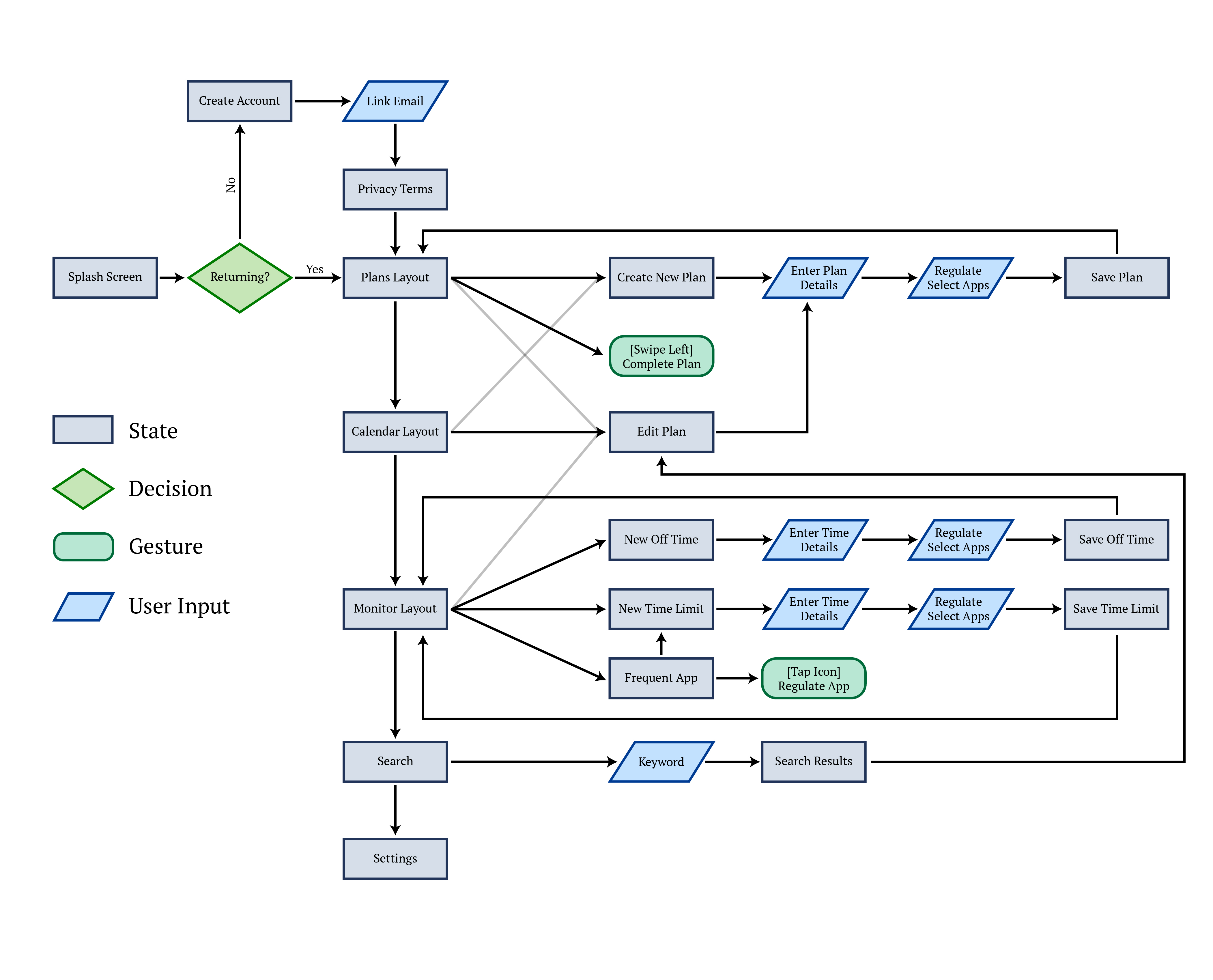
I carried over the principles in building the user flow, prioritizing:
• simplicity in user routes
• consistency in user tasks
• flexibility in user inputs
• cohesion in its information architecture
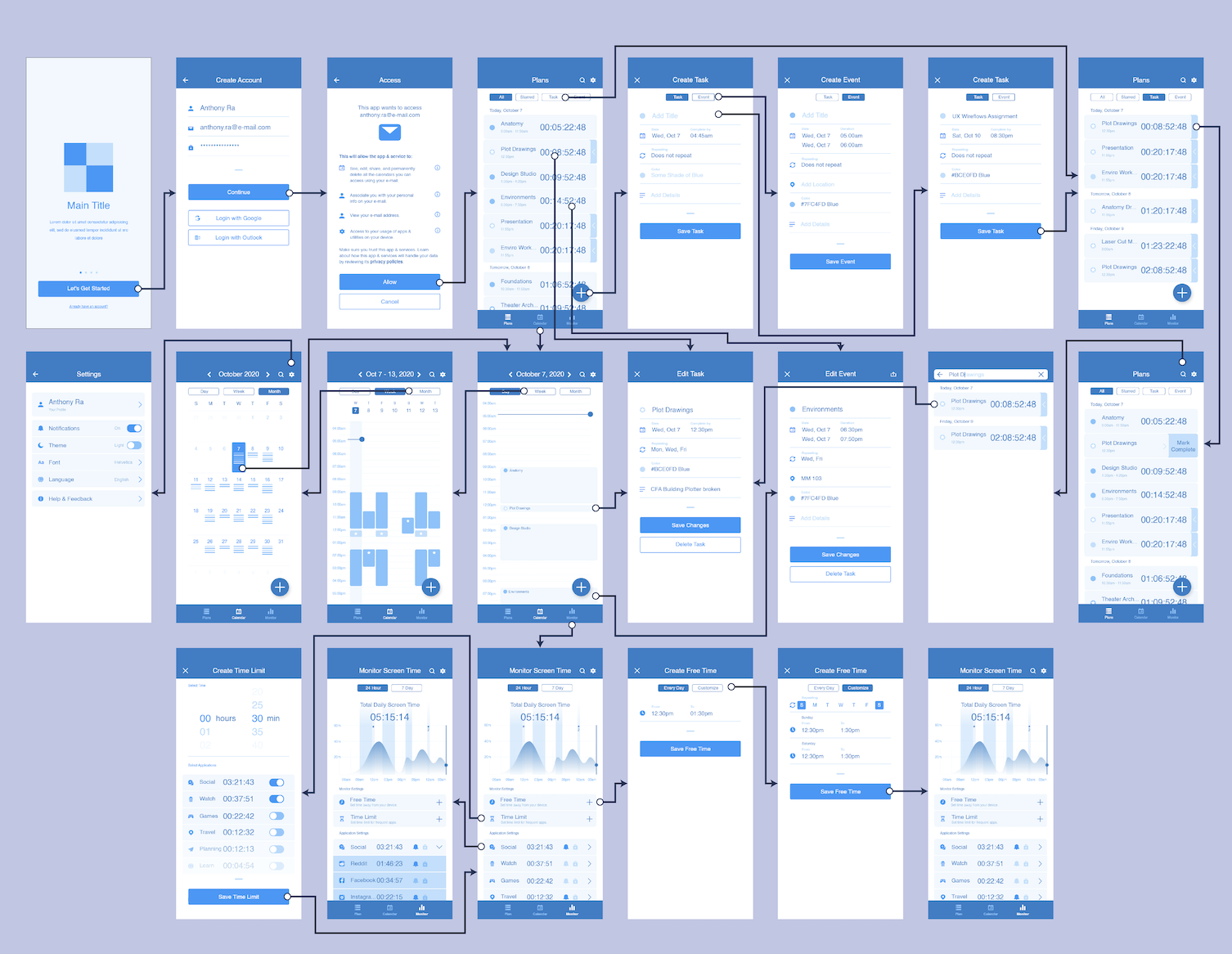
Transitioning from bubbles and lines to sketches and drawings lets me...
• generate visual solutions for user struggles
• present a story both familiar and unique
• create design consistency in each screen
• Test mobile gestures and transitions
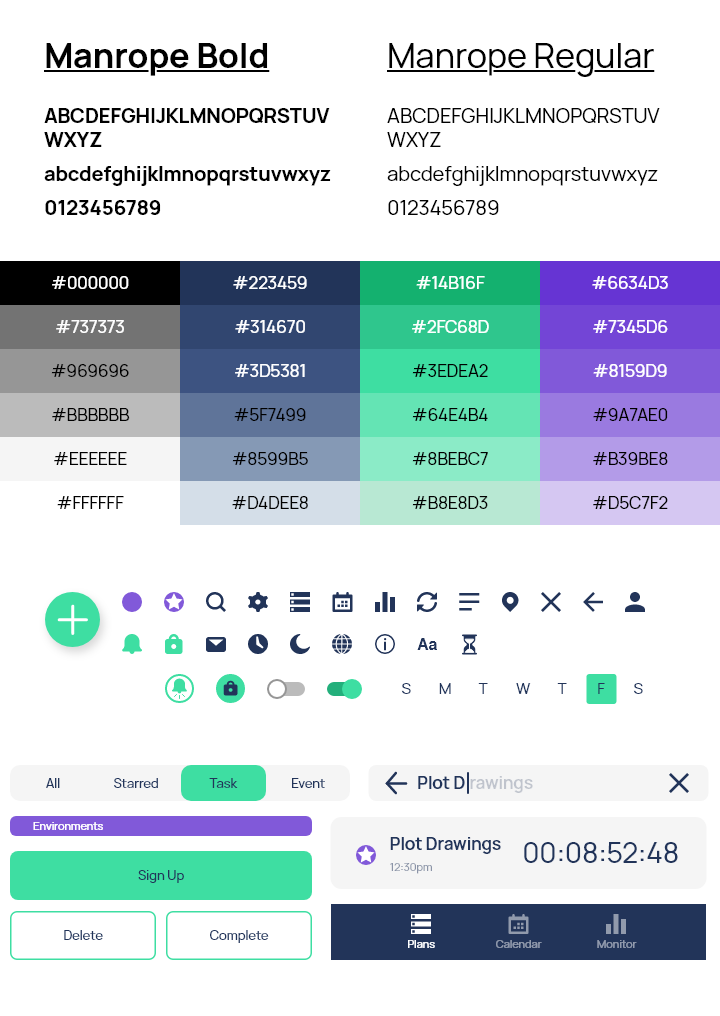
Typography
Font family 'Manrope' is professional but not overly strict. It carries a neutral personality with hints of originality.
Colors and Hues
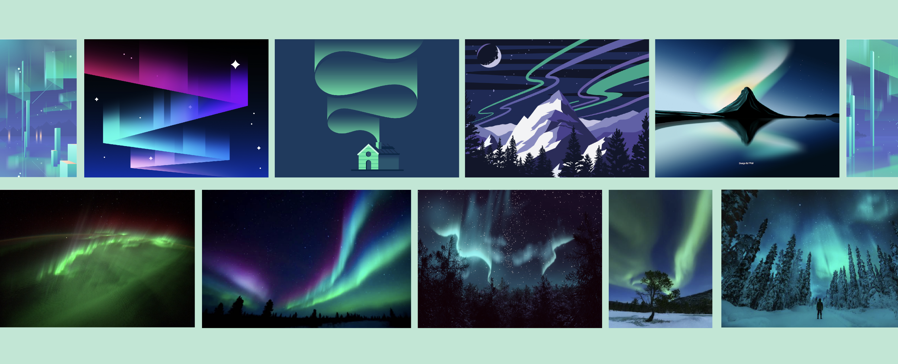
Green (primary) represents success and growth while purple (secondary) represents individualism and drive.
Navy (background) is just simply cool and steady.
Iconography
Universal comprehension is important for a product heavily reliant on visual icons.
I am aiming for a minimal but pleasing layout for users aspiring to get ahead in there lives.
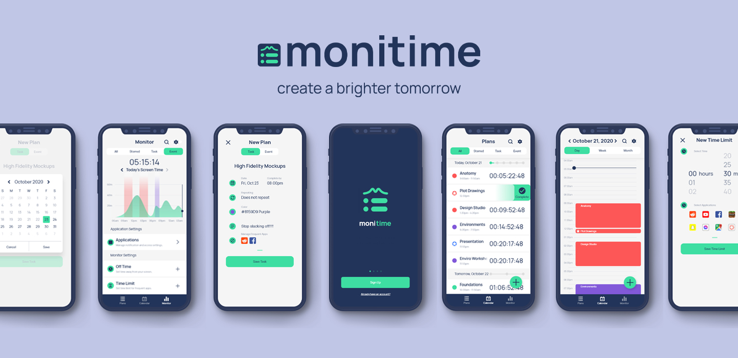
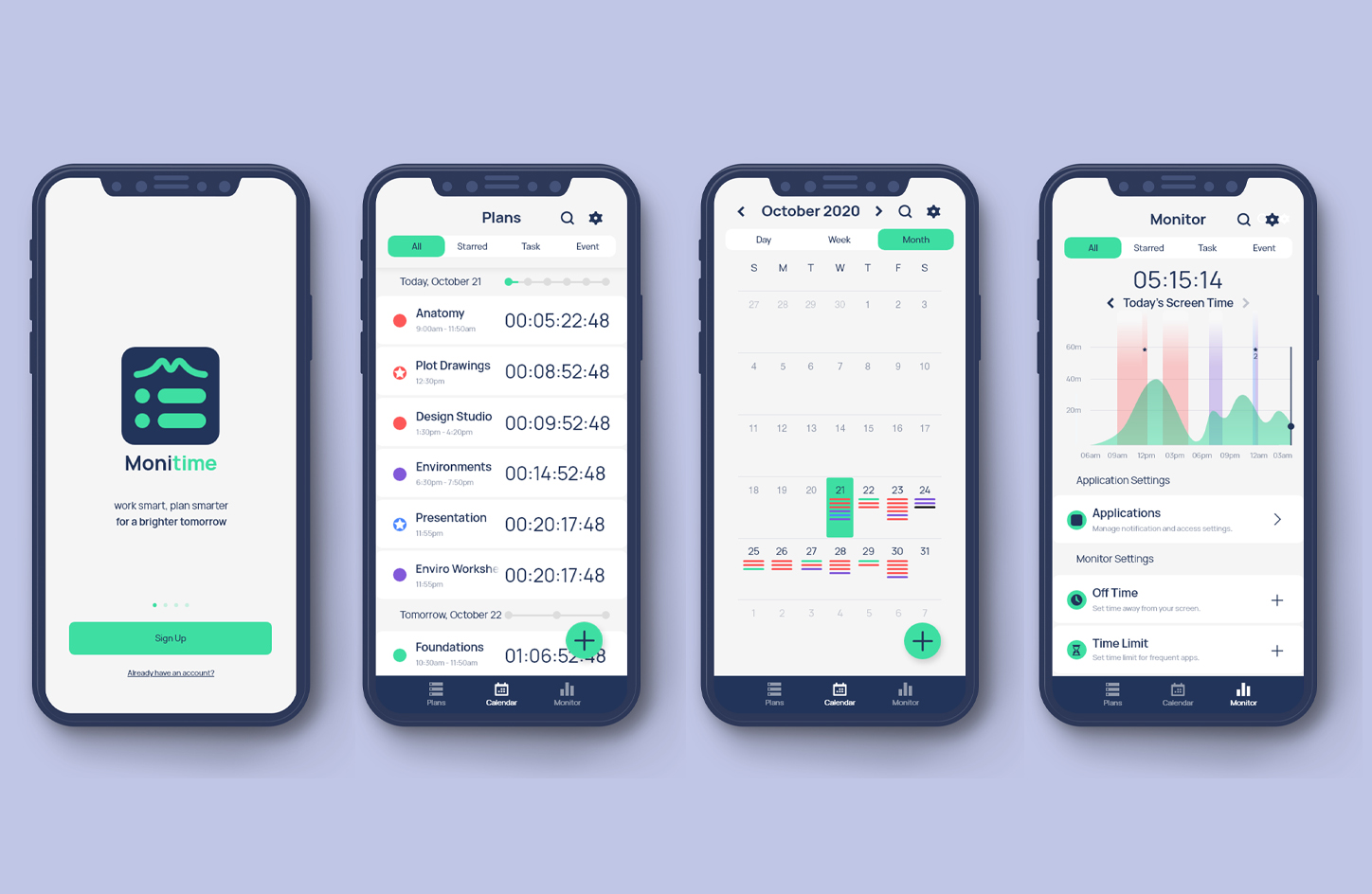
Cohesive user experience
Monitime presents plans, calendars, and monitoring features where users can confidently tell themselves:
• which tasks should I be prioritizing?
• how will I prepare and visualize upcoming plans?
• am I making the best use of my time?
• what can I do to take advantage of my health?
Maintaining consistency
Despite a distinctive display, Monitime maintains consistency in essential user routes.
Users are also provided pathways to regulate distracting apps to stay ahead of their game.
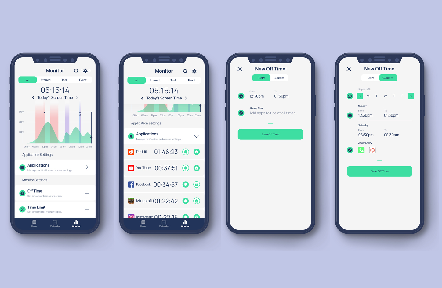
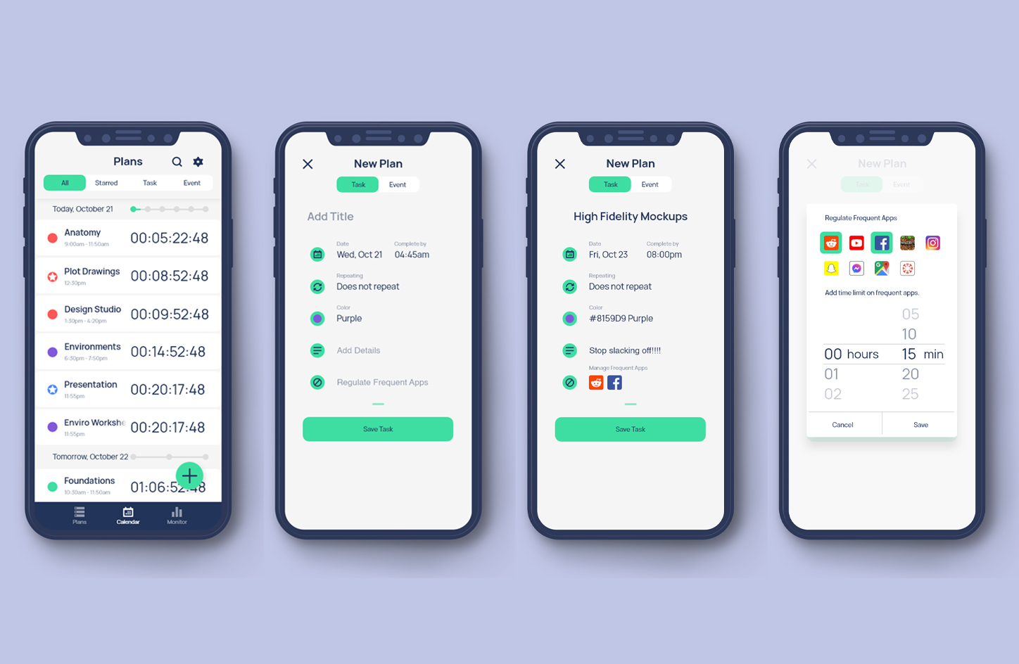
Managing work time
Monitime gives users a visual correlation between their screen time usage and their deadlines. Users can take advantage with the app's:
• digital app breakdowns and accessibility settings
• custom "off-time" to escape from the digital load
• timed limit on secondary distracting apps
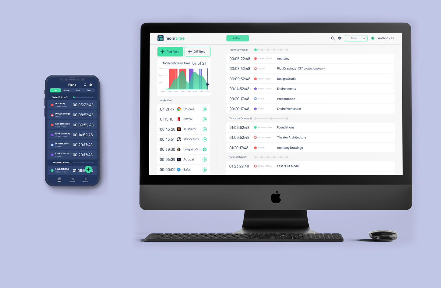
Diversity of use
Monitime caters to users in universal design and device preference to appease all styles of work.
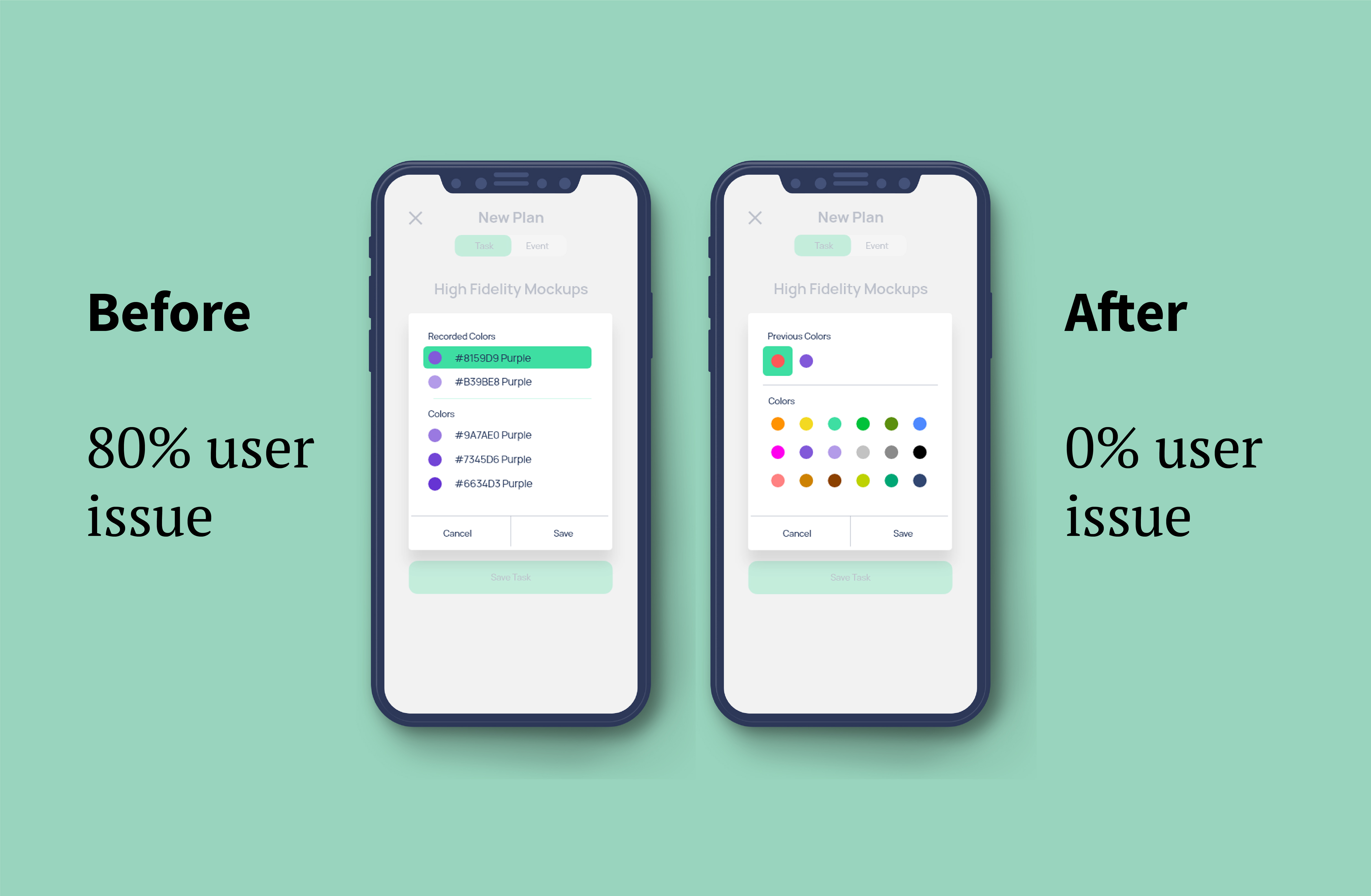
Feedback - Organization and colors
Color coding deadlines enhance user freedom and organization; however, I initially provided hues of one color to strictly maintain the app's style. Users were confused because:
• They had no clue what the hues indicated:
• Are they indicating individual progress?
• Are they indicating priority level?
Overall, colors for organization need to be distinctive and - at times - contrasting.
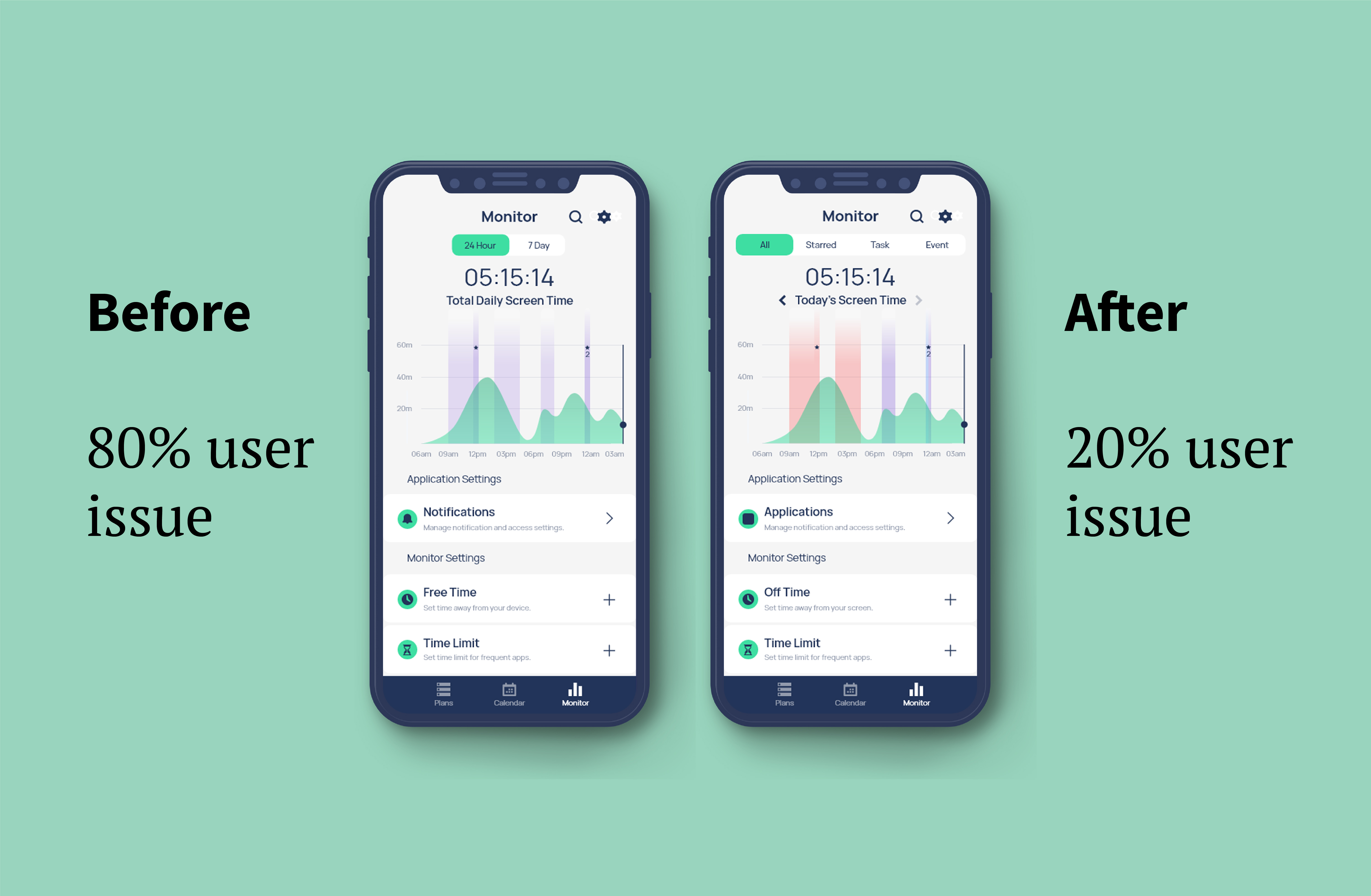
Feedback - Functionality and naming
There were two main realizations with the novel 'Monitor' screen.
Displaying the screen time graph by deadline type was more consistent and effective than displays by time.
Altering some language to 'Applications' and 'Off-time' delivered closer to its intent.
Designing from assumptions and personal opinions complicates the job.
Let potential users take part in the design vision.
Document everything - even the seemingly useless.